


Flagship Reviews
Re-igniting an expressive brand’s identity with eye-catching instagram content and a
refreshed logo suite.
Expertise
Visual Branding, Graphic Design &
Creative Direction
Software
Adobe Illustrator, Photoshop &
Procreate
Client
Flagship Reviews
Timeline
Dec 2023 - Jan 2024
Project Overview
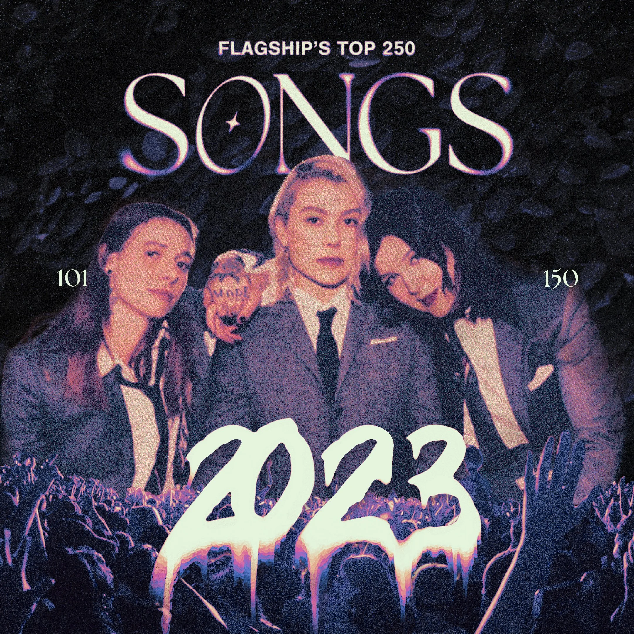
In 2021, I worked with the manager of Flagship Reviews previously to design some of their Top Songs posts. For 2023, they wanted to go even bigger. They had over 3x the posts to create, each with more entries than years prior. They wanted a similar style to the previous work I had done: grunge layouts that highlight popular musical artists alongside the entries.
They gave me full creative control over these designs, but asked for an overall consistent style. In addition, they expressed interest in seeing new logo concepts, as their current logo doesn’t match their identity: a review page to highlight and explore bold, expressive, and exciting music.
Client Asks
Create a series of Instagram carousels highlighting the top songs, albums, and EPs released in 2023.
Find a cohesive creative direction featuring artist photos, then run with it.
Try your hand at some logo concepts if you have time!
Personal Goals
Create bold and expressive layouts and push my skills with texturing and compositing images.
Experiment with blur, grain, typeface matching and effects, and different blend modes.
Make seamless transitions for each carousel.
Design a logo suite that could work independently or together.
Challenges
Balancing visuals with very text-heavy compositions.
Meshing multiple reference images together for seamless background transitions.
Managing effects and textures while maintaining legibility.
Creating a new logo suite that would work for Flagship’s Instagram and beyond.
Graphic Carousels
Top Songs
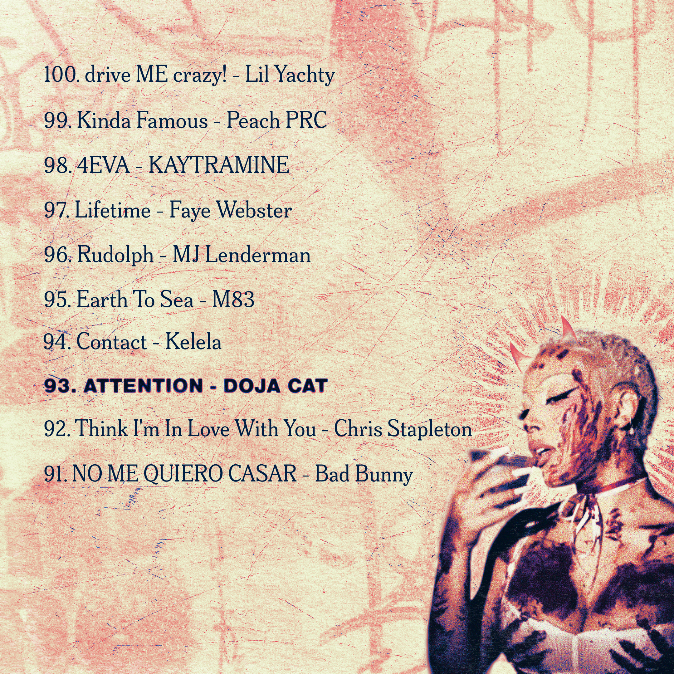
For these 200 songs, I broke them into four posts, each with a cover image and five carousel slides. For the cover, I highlighted one main artist on the “center stage,” masked them, then composited an audience in front of them. For the remaining slides, I formatted each song title and their ranking, then highlighted another artist.
Each post has a distinct gradient map, textures, and theme. Once the cover and highlight artists photos were selected (and their respective creators credited), I began experimenting with reference photos and textures from Unsplash to settle on the style. After that, I made a seamless background composition that I would slice up before formatting text over top.
See the posts below:
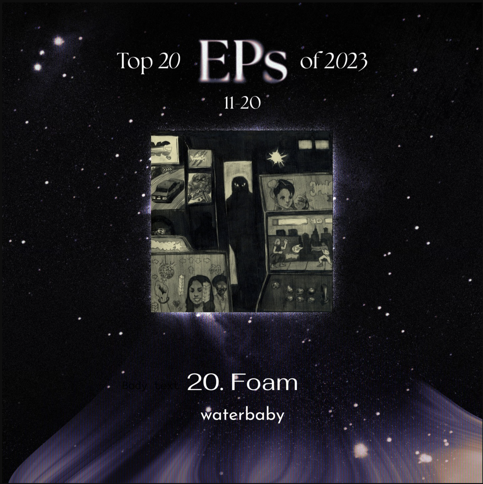
Top Albums and EPs
These posts all had a deep space/astronomy theme (one of my favorite subjects), and differed in multiple ways:
EPs
Due to both time constraints and formatting limitations (Instagram only allows 10 photos per carousel), these posts couldn’t have cover images. In order to meet the post deadlines, I worked with Flagship’s manager to create templates for posts that they could update easily (EP cover art, titles and artist names).
Albums
Rather than highlight artists, the album covers themselves served as the visuals on each carousel. I experimented with multiple layouts, then collected all the cover images to drag-and-drop into pre-set frames within Photoshop.
For the covers, I explored the idea of making the vinyl records part of the astronomy compositions (the surface of the moon, and the rings of Saturn), and used halftone printing effects and paper textures to mimic zines.


Danny Brown for Vulture
Photo by Victor Llorente
Caroline Polachek
Photo by Aidan Zamiri
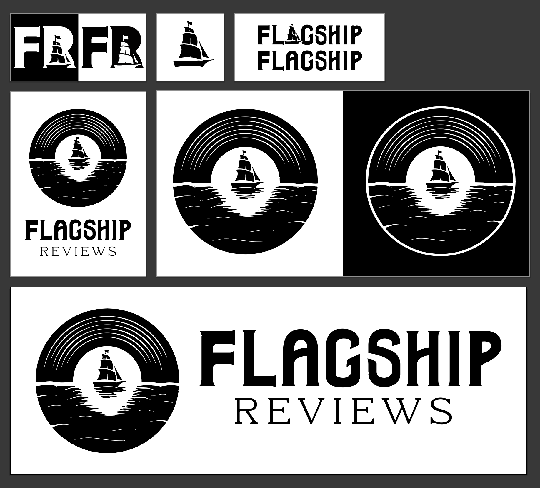
Logo Suite
Why “Flagship”?
In talks with the manager, I learned that “Flagship” was selected as the brand identity for various reasons:
Historically, a flagship was the highest profile, highest commanding ship in a fleet, and was considered the best vessel in all aspects.
Now, “flagship” is used across many industries to signify the best products offered.
By extension, “flagship” was chosen to indicate a sense of authority on the subject of music, and a “leader” persona – just as a flagship commands the fleet, Flagship Reviews leads its reader’s to discover new, quality music and talent.
I took these brand rationales to the drawing board (literally) and began sketching various ideas, combining simple lettermarks and icons (ideal for Instagram’s smaller, circular account pictures) with ship/nautical imagery.
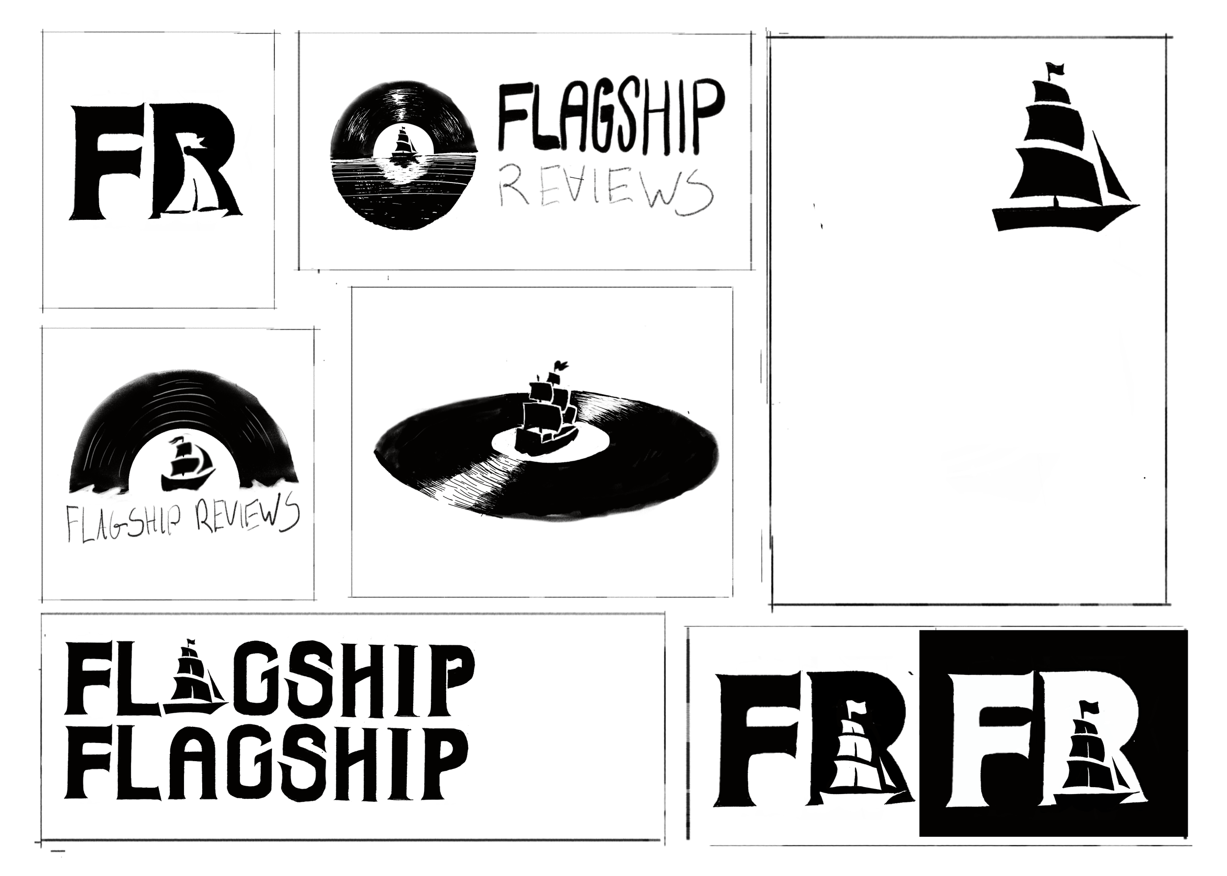
Testing the Waters
While experimenting with different ideas, my process quickly highlighted the potential for a logo suite with inter-related themes:
I experimented with how a flagship might interact with a vinyl for a circular badge or combined logo, and went through multiple iterations trying to get the wake/reflections right before choosing to simplify the idea.
I had the idea to use a sailboat as the negative space inside of the “R,” for the lettermark. A sail is featured on the current logo, but that doesn’t display a “flagship’s authority”, and didn’t mesh well with some other ideas that used larger ships.
In order to accommodate a larger ship and still maintain legibility, I adjusted the glyphs of a bold font to have small, soft serifs. This supplied adequate negative space, and gave way to new ideas for a logotype to match.
Lastly, I adjusted the logotype to mimic the curves of sails within the negative space of some glyphs. I was also inspired by older atlas fonts and nautical imagery (fishing hooks, sea serpents).
Final Thoughts
This was an exciting project to experiment with different techniques in visual design, creative direction, and brand redesigns. It was great being at the helm creatively.
Throughout the project, I expanded my understanding of advanced photoshop techniques, utilized more hand-drawn brand design, and practiced embracing the creative flow instead of trying to force a certain idea or solution.
Talking with the client on each step of the process really helped both of us hone in on brand/design pillars, and they were very pleased both the carousel and updated logo suite ideas.
Lessons Learned
Keep it loose & tight.
In the beginning, its a good idea to let myself explore and experiment with new ideas before coming up with a repeatable process, style, or approach.
Once an idea is found, brainstorm how to expand it without losing cohesion.
Don’t get lost in the seaweed (scope creep).
It’s easy to get carried away when you’re given full control of creative vision. Knowing when to cut out or simplify certain aspects of a project can help me meet deadlines and alleviate rabbit holes or creative block.
Project Resources & Photo Credits
Resources & Typefaces
Background Photos and Textures from Unsplash.
Nimbus Sans Typeface
Meursault Variable Font
The Seasons Typeface
Sigurd Typeface
Artist Photos
Caroline Polachek, Photo by Aidan Zamiri
Danny Brown for Vulture, Photo by Victor Llorente
Rosalía, Photo by Daniel Sannwald
George Clanton, Photo by Alex Bush
Tkay Maizda, Jonathan Weiner for NME
Hannah Diamond, via Instagram
Bad Bunny, Photo by Amy Harris
Christine and the Queens, Photo by Camille Vivier
Janelle Monáe, Photo by @caver_imaging
Yung Thug for CNN, Photo by Steve Schaefer
Addison Rae, Photo by Dillon Matthew
Jessie Ware, Photo by Jack Grange
boygenius for NPR, Photo by Shervin Lainez
Billie Eilish for Los Angelos Magazine,
Creative Direction by Ada GuerinGorillaz, Illustration by Nasty Little Man
Beach House, Photo by Shawn Brackhill
Japanese Breakfast, Photo by Cameron Brisbane
Carly Rae Jepsen for Fader, Photo by Meredith Jenks
Travis Scott, Photo by Adrienne Raquel
Doja Cat, via Instagram (now deleted)
Lana Del Rey for Interview Magazine, Photo by Nadia Lee Cohen
Dua Lipa, via Instagram
Bully for Rolling Stone, Photo by Sophia Matinazad